Tag: Vertigo Comics
-
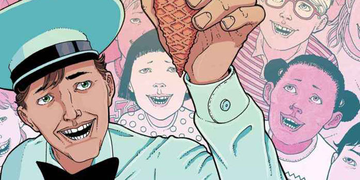
On The Shelf #4: Books Heal All Wounds
A self-published farewell topped with rainbow sprinkles courtesy of the Ice Cream Man.
-
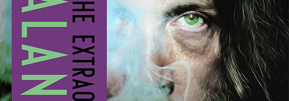
Alan Moore Bio ‘Magic Words’ Reminded Me of the Joys of Paper
Today the folks at Aurume Publishing sent me a review copy of Lance Parkin’s Alan Moore biography, Magic Words, and some small part of me went mushy.
-

Before Watchmen: Comedian/Rorschach TPB Review
When the guys at DC comics came up with the idea of Before Watchmen they must have felt like Butch and Sundance looking over that gulley.
-

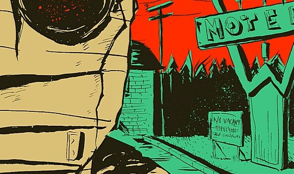
A Sickness in the Family Graphic Novel Review
2010, Vertigo Crime Story: Denise Mina Art: Antonio Fuso, Lee Burmejo (cover) If countless books and movies are anything to go by, we do love to watch middle classed families fall apart. Denise Mina’s A Sickness in the Family, the latest in DC’s Vertigo Crime imprint, is a gruesome study of one such affluent and…
-
The Nobody Graphic Novel Review
2009, DC/Vertigo Written and Illustrated by Jeff Lemire With Canadian artist/writer Jeff Lemire’s Sweet Tooth currently receiving widespread acclaim, his previous efforts Essex County Trilogy and The Nobody are justly receiving a great deal of backdated attention. But it’s easy to appreciate why The Nobody slipped under the radar last year; this contemporary take on…
-
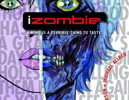
iZombie #1 Comic Book Review
Vertigo, $1.00 Story: Chris Roberson Art: Michael Allred Colours: Laura Allred iZombie is an odd first issue, in that for a title debuting at an alluring $1 it offers little in the way of a hook, or any reason that readers might want to return next month. That isn’t to say that it’s a bad…
-
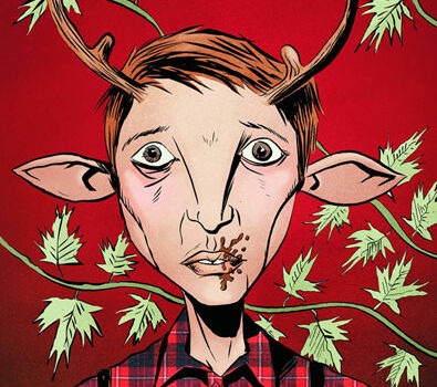
Sweet Tooth vol. 1: Out of the Deep Woods Review
Vertigo. 2010 Story, Art: Jeff Lemire Colours: Jose Villarrubia There’s a certain sense of intimacy that comes through whenever an independent comic creator handles both the art and writing duties on a comic. When Eisner-nominated Jeff Lemire (Essex County Trilogy) moved to Vertigo, these indie sensibilities thankfully remained intact in The Nobody, an eerie homage…
-
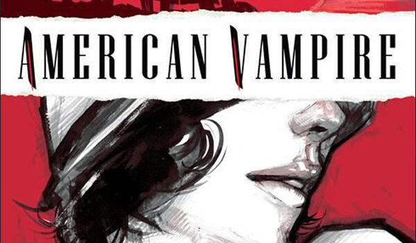
American Vampire #1 Comic Book Review
DC/Vertigo, $3.99 Writers: Scott Snyder, Stephen King Art: Rafael Albuquerque Colours: Dave McCaig It’s practically impossible to review American Vampire without first mentioning that Vertigo’s latest marks the comic book debut of Stephen King, who’ll be providing a 5-part secondary tale in this ongoing “vampires through the ages” series from Scott Snyder. And a solid…