Even as I first started writing Welcome to The Fold, I always had a lucid vision of the finished book in my mind. What it would look like. How it would stand out on the shelf. How it would smell. How the pages would taste after being sautéed in garlic oil.
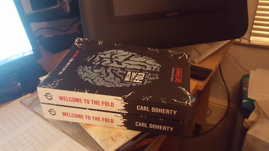
A decade later and I’m now staring at a proof of the physical edition, which comes some 18 months after the second book of the digital edition released, and nigh on 6 months after the combined digital edition.
And I can’t stand it.
Maybe it’s my deficiency as a designer that’s to blame. Maybe I’m just impossible to please. Maybe CreateSpace’s print job simply isn’t up to my normal standard.
Either way, I’ve finally made a bunch of amendments and sent off for a second trilogy of proofs, two of which will probably be forced onto associates I pretend to like but secretly resent. Here’s a few things I picked up from my first foray into printing novels via Amazon’s CreateSpace service:
White Paper vs Cream Paper
CreateSpace prose books come in two flavours: white and “cream”. I made the mistake of opting for white paper, thinking that it would contrast pleasingly against the “liquorice” matt cover. This couldn’t be further from the reality, and the end result looks a little, well… cheap.
This is not to say that the text isn’t cleanly and clearly printed, but that my eyes are used to reading black text on an off-white page. The pure white lends the book the feel, for want of a better term, of a work of academic publishing. And, let’s face it, nobody wants to read novels that remind them of university.
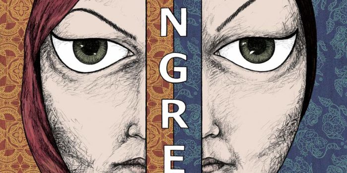
Digital Printing Cover Woes
CreateSpace books, more specifically their covers, are printed digitally, as opposed to lithographically. Given how good modern digital printing technology is, there’s not much of a difference… except on large areas of the same colour, where there’s something almost indiscernibly washed out about the end result. Unfortunately, Fold‘s vector-based cover, with its off-black background, suffers from this miniscule sacrifice in print quality more than a photograph or painted image on gloss paper would.
It should be noted that I work in marketing and design, and probably apply a more critical eye to such things than most. Overall, though, I was very impressed with CreateSpace’s product.
Typefaces Make all the Difference
Yes, it’s an obvious tip to have to emphasise, but nevertheless…
In my day job, when designing with new promotional material I tend to spend considerable time analysing the competitors and market to find a font that a) the target audience will find familiar and reassuring, but b) is distinct and adds a bit of creative flair. myfonts.com’s WhatTheFont! is really useful for finding out what typefaces other designers are using.
For the first Welcome to The Fold proofs, I pulled a few random fonts out of my ass, shoved them on the front and back covers and sent the damn thing off to print, and I’ve no idea why I didn’t spend longer looking at books of a similar genre…
Oh well, at least a few valuable lessons have been learned.


Leave a Reply